Design system
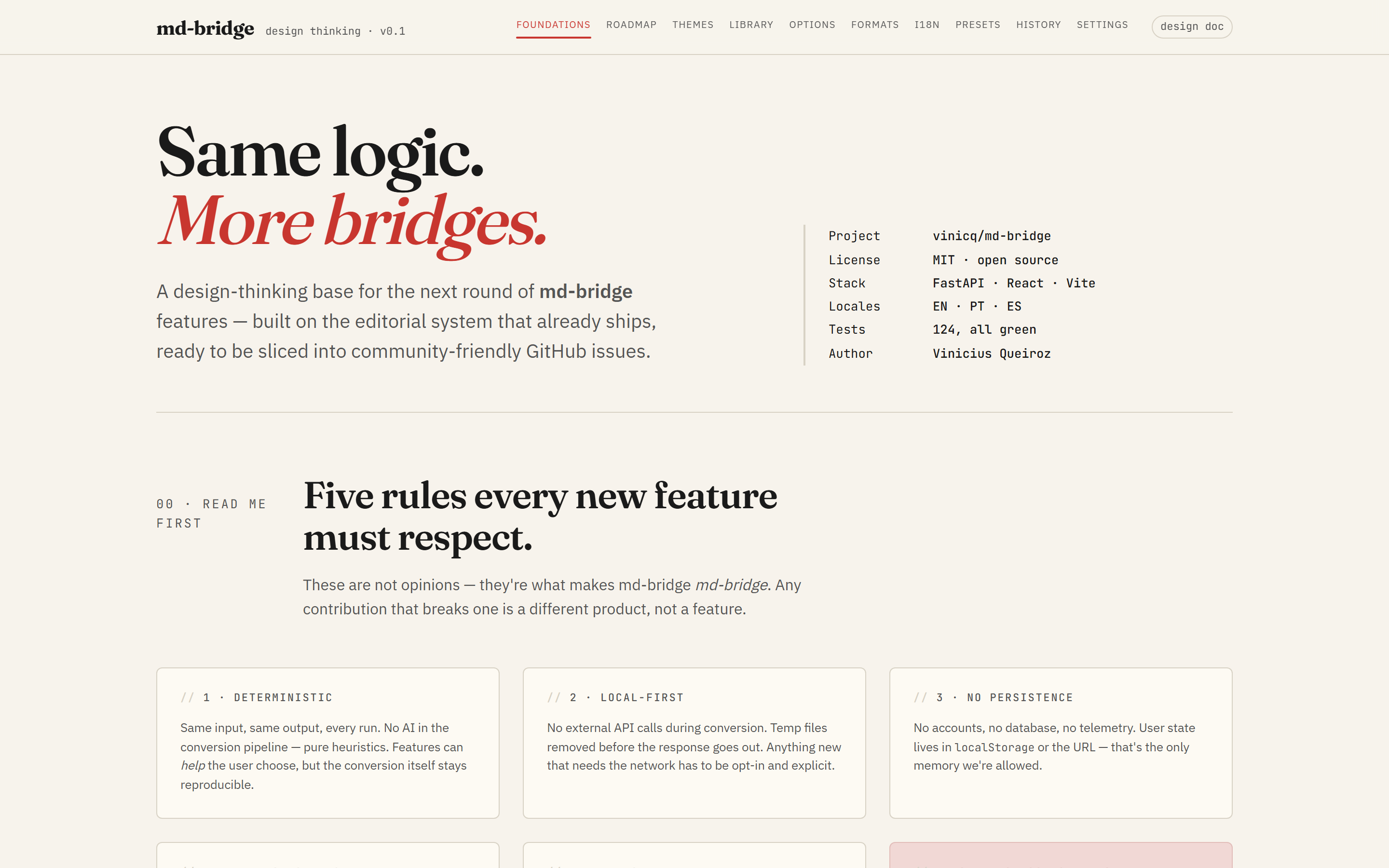
Every UI change in md-bridge tracks back to a mockup in this catalogue.
The catalogue lives as a single self-contained HTML file
(design-thinking.html) that reuses the same
design tokens as the React app (apps/web/src/styles/tokens.css), so
when the tokens move the mockups move with them.
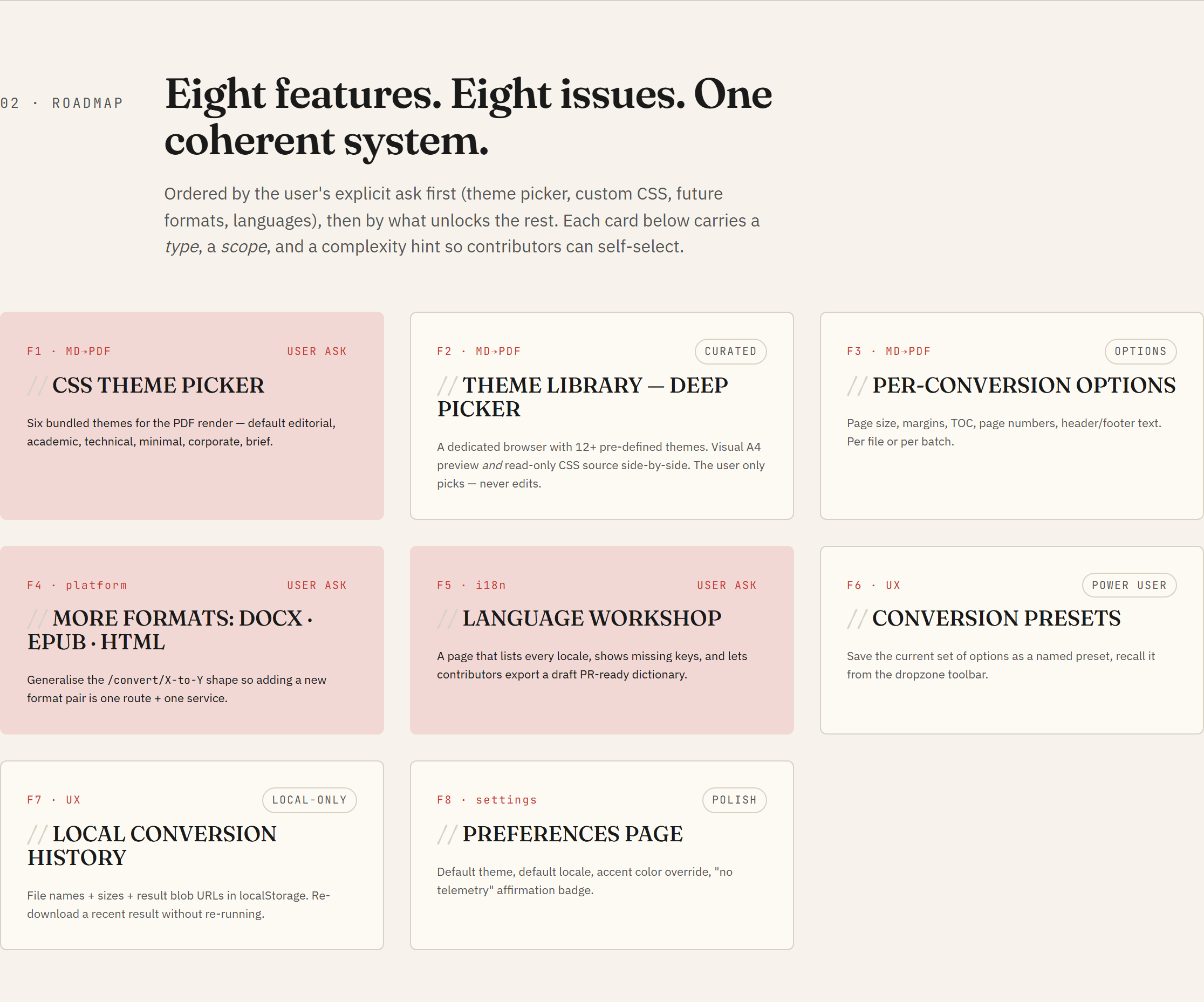
Roadmap at a glance
Principles
Five rules every new feature must respect. They are not stylistic, they are the things that make md-bridge useful in the first place:
- Deterministic. Same input, same output, every run. No model, no randomness, no time-of-day branching.
- Local-first. Nothing leaves the user's machine. Conversions run in a temp directory and the directory is wiped before the response is sent back.
- No persistence. The server holds zero state between requests.
Anything a user wants to keep (themes, presets, history) lives
client-side, in
localStorageor in the browser file system. - Heuristic, not statistical. The conversion code is hand-written rules. New features extend the rules; they do not introduce trained models or third-party inference calls.
- Editorial UI. Type-driven, calm, restrained. The serif wordmark, the warm paper background, and the single accent red are the visual contract; new screens fit inside it, not around it.
What is in the catalogue
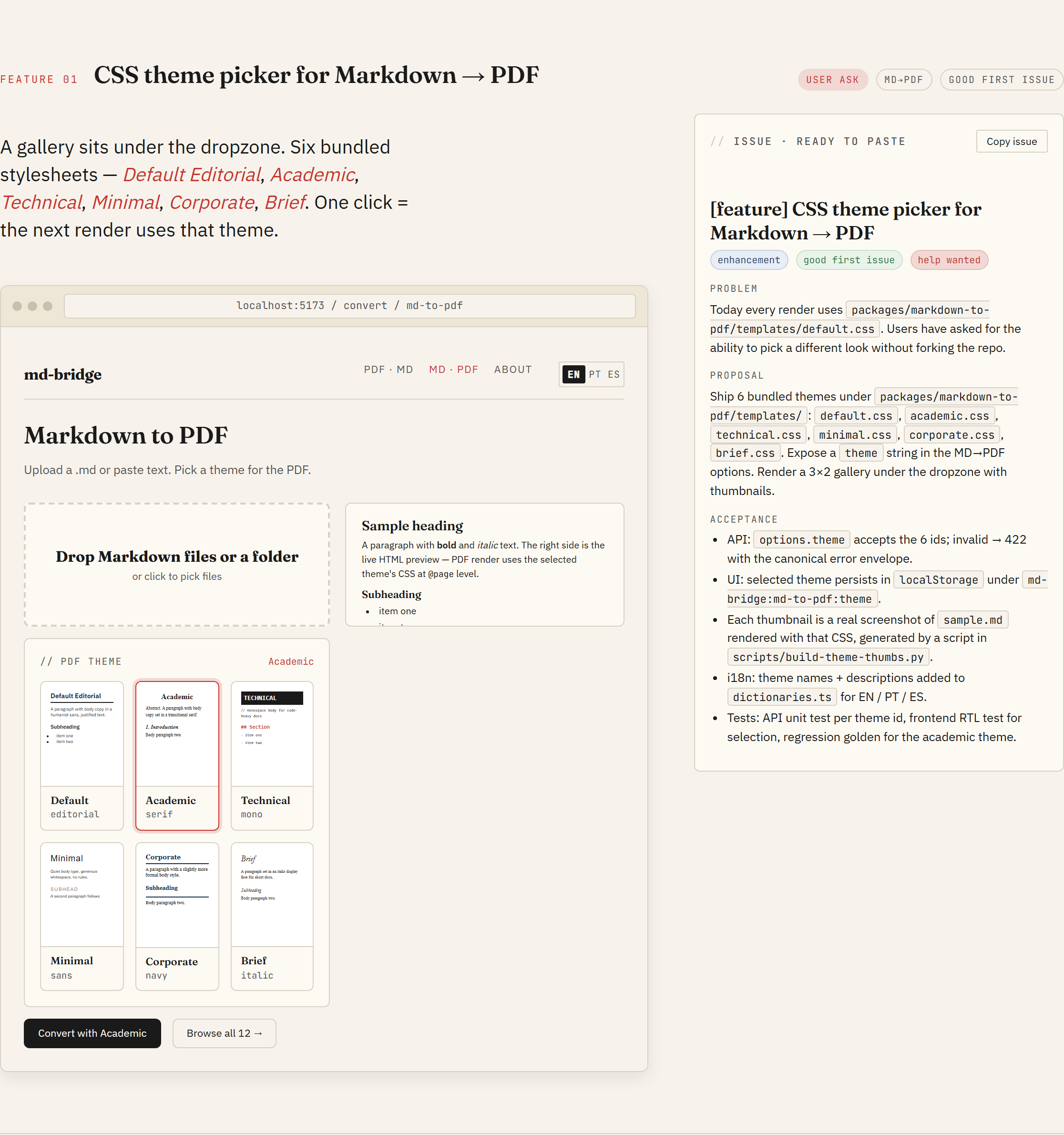
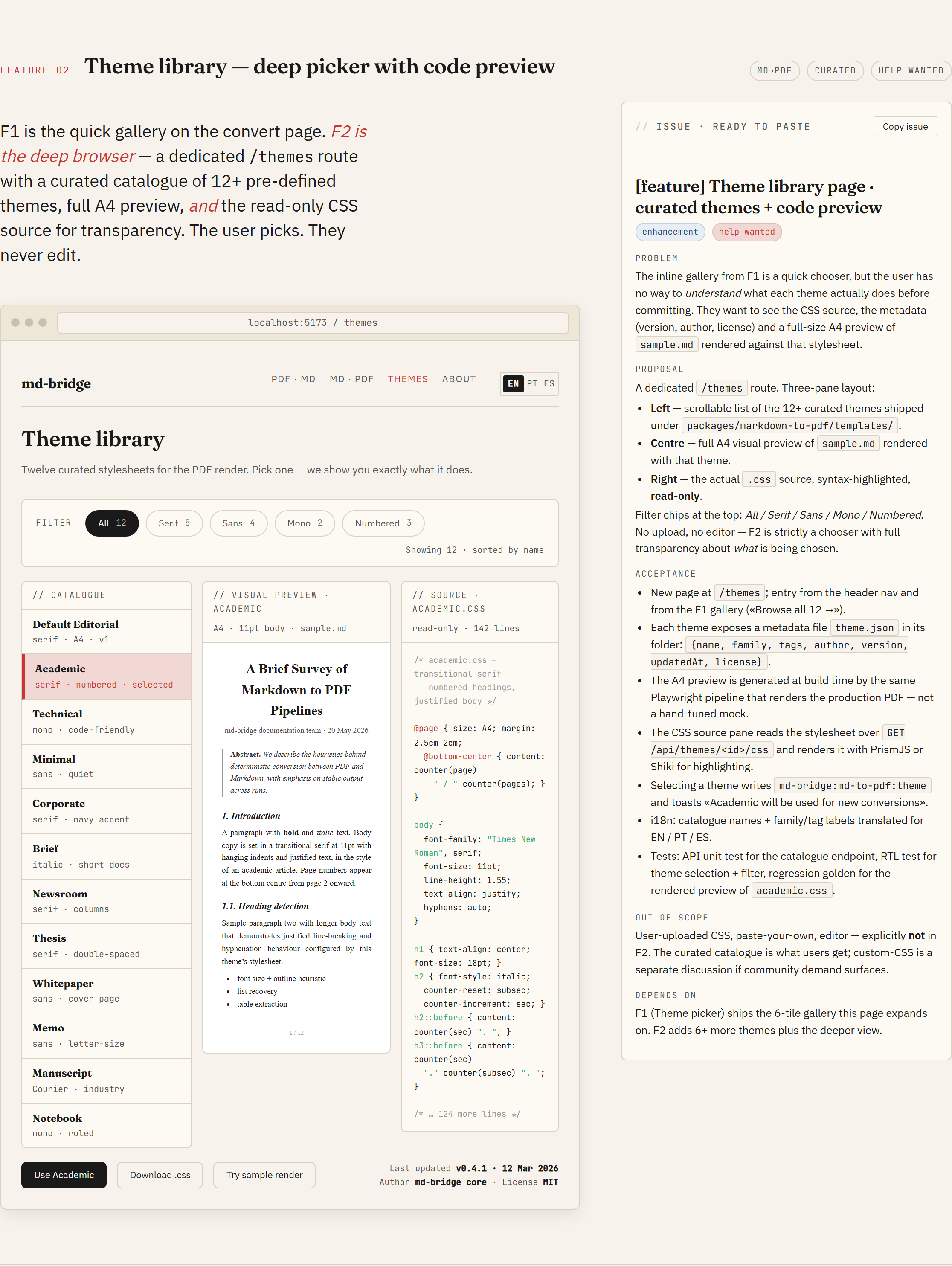
Eight features, each with a full mockup and a paste-ready issue body. The catalogue header carries a scroll-spy nav, so you can jump straight to the feature you care about. Each feature page has two columns: the hi-fi mockup on the left, the issue spec on the right. The Copy issue button on each spec gives you the exact markdown to paste into a new GitHub issue.
F1 · CSS theme picker for Markdown → PDF
F2 · Theme library (deep picker with code preview)
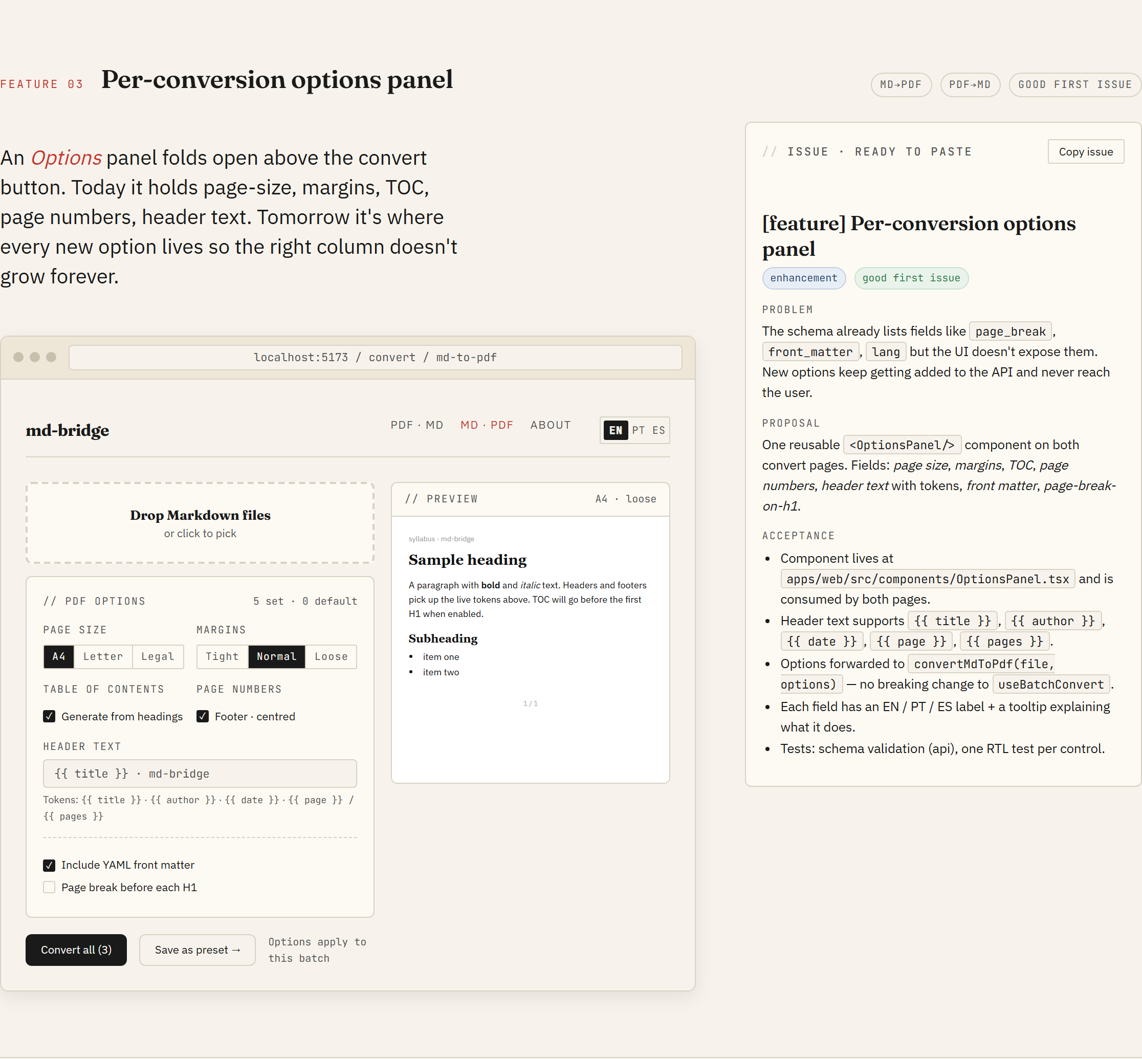
F3 · Per-conversion options panel
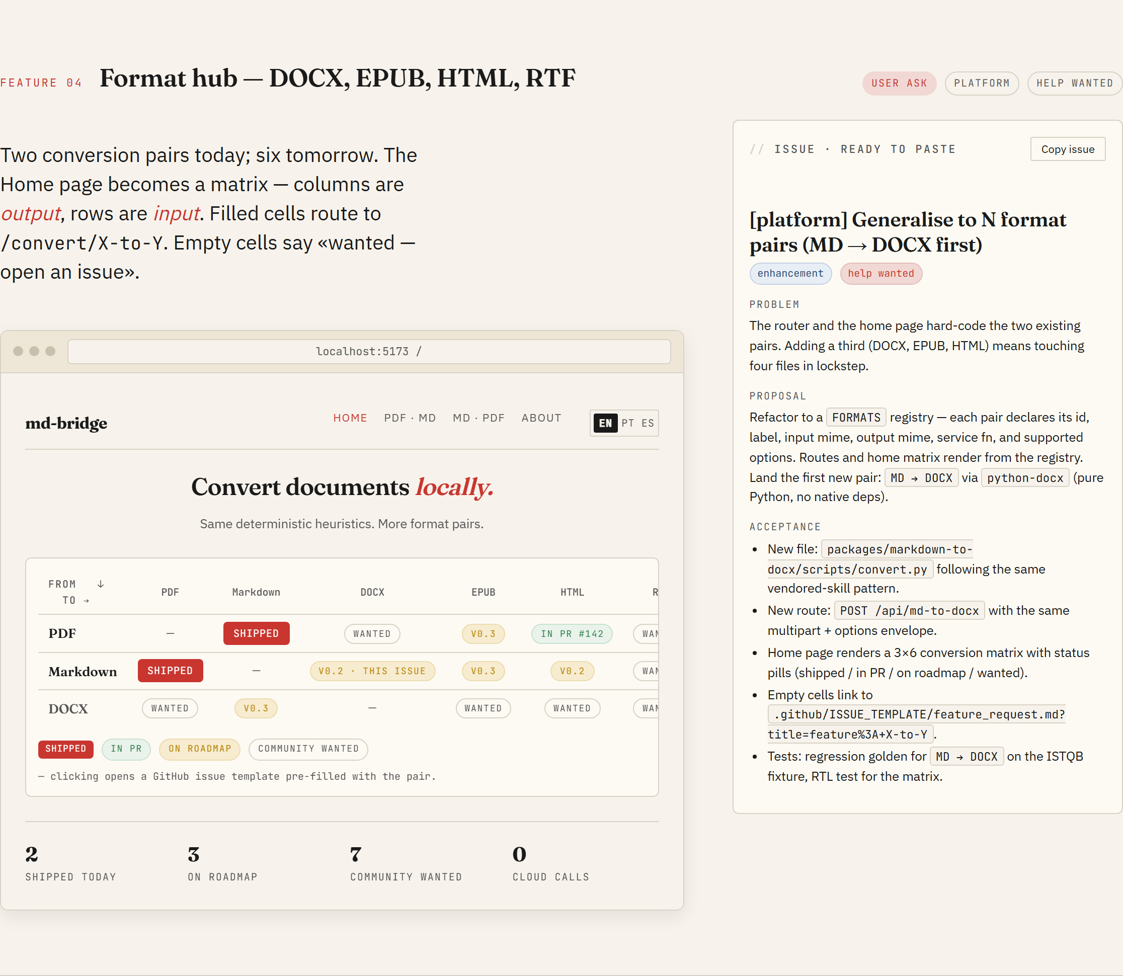
F4 · Format hub (DOCX, EPUB, HTML, RTF)
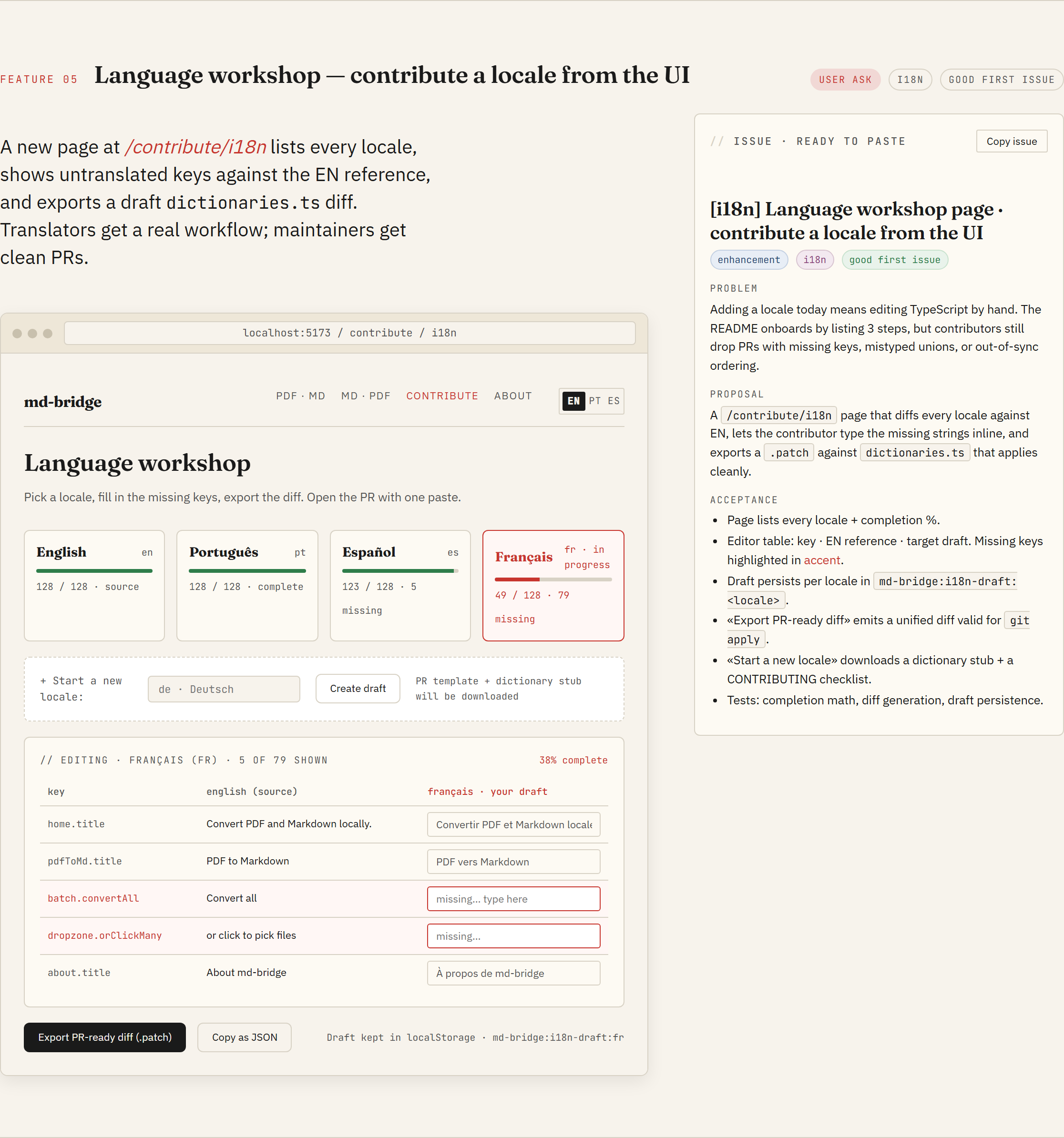
F5 · Language workshop
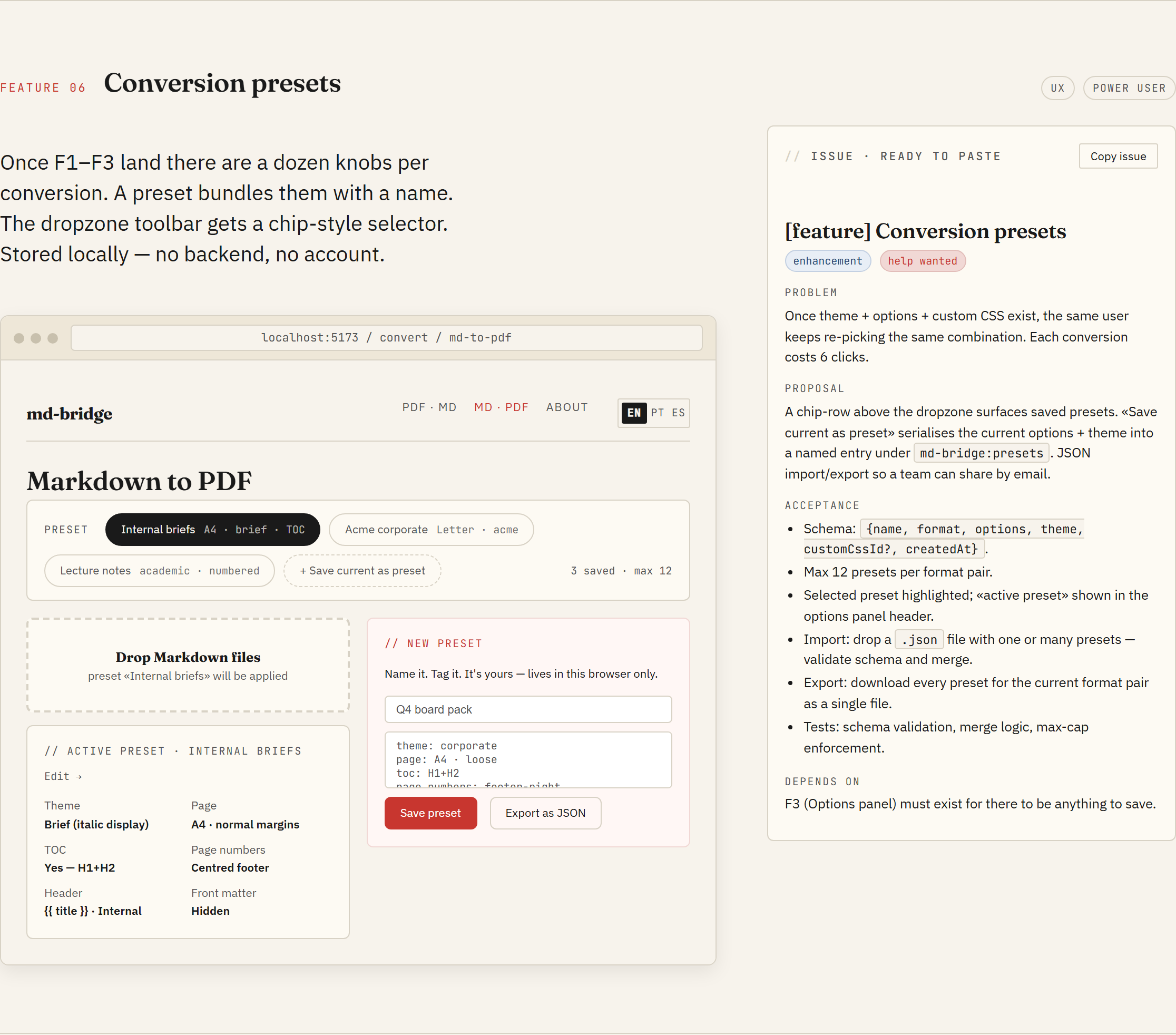
F6 · Conversion presets
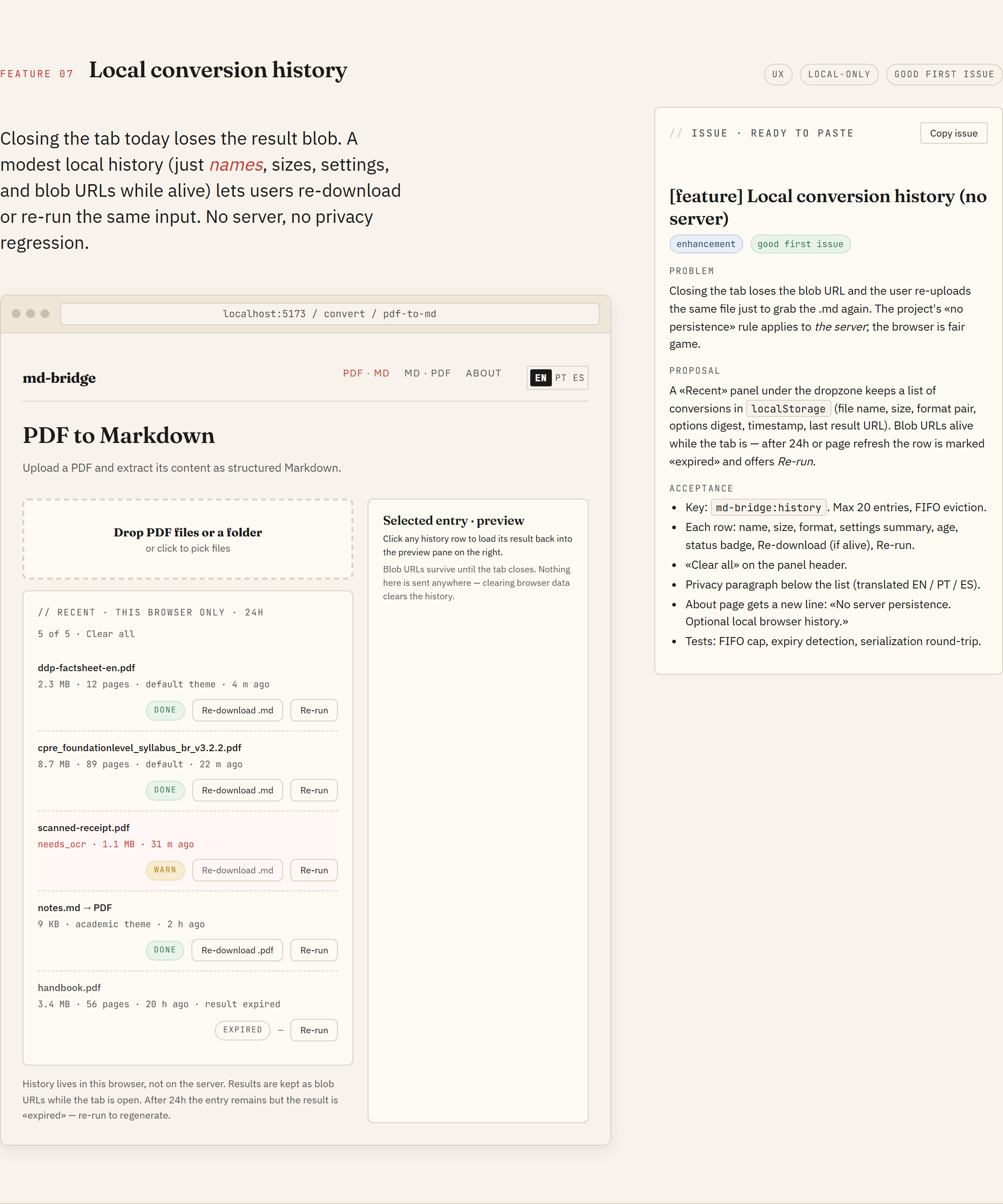
F7 · Local conversion history
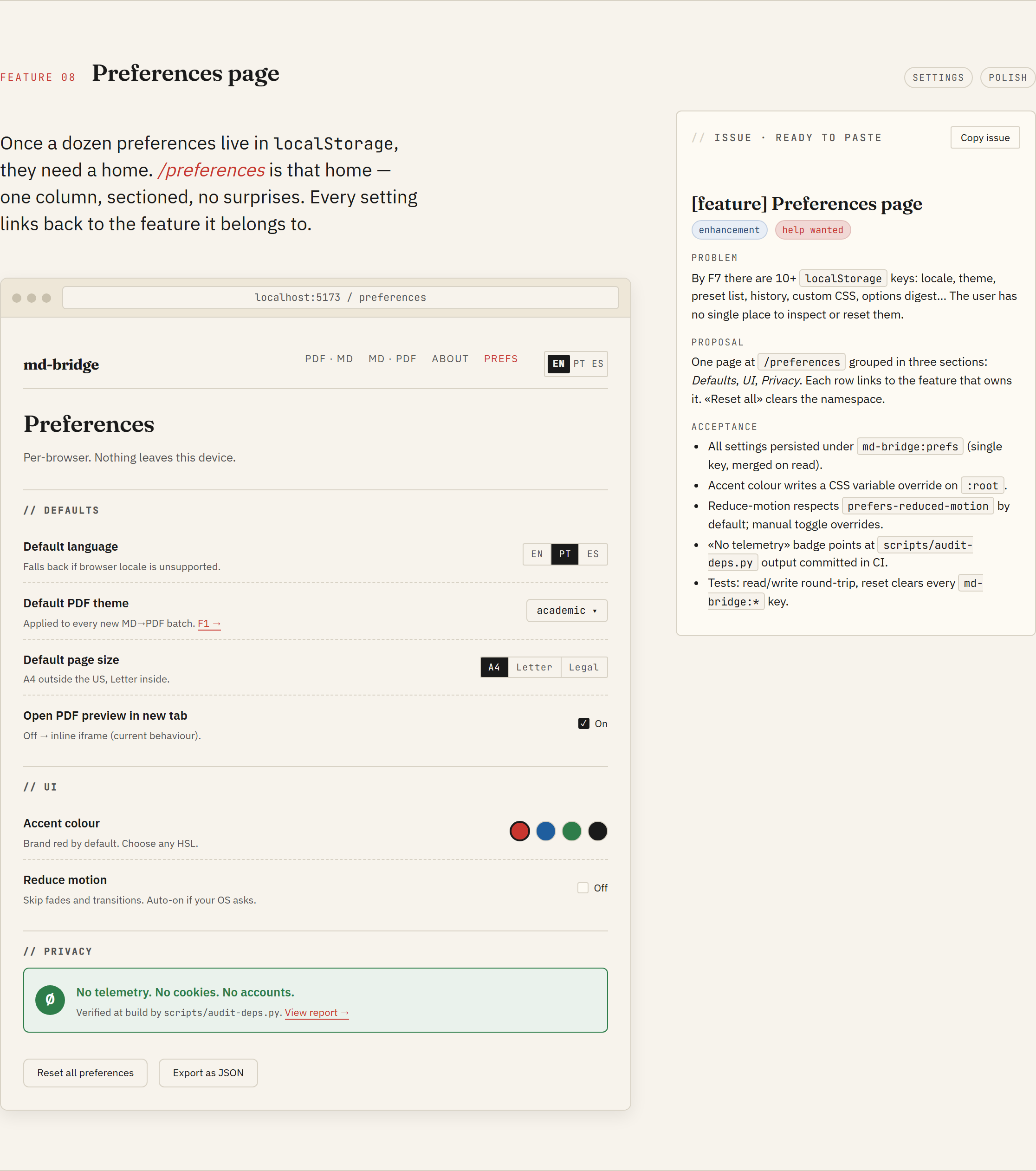
F8 · Preferences page
Foundations
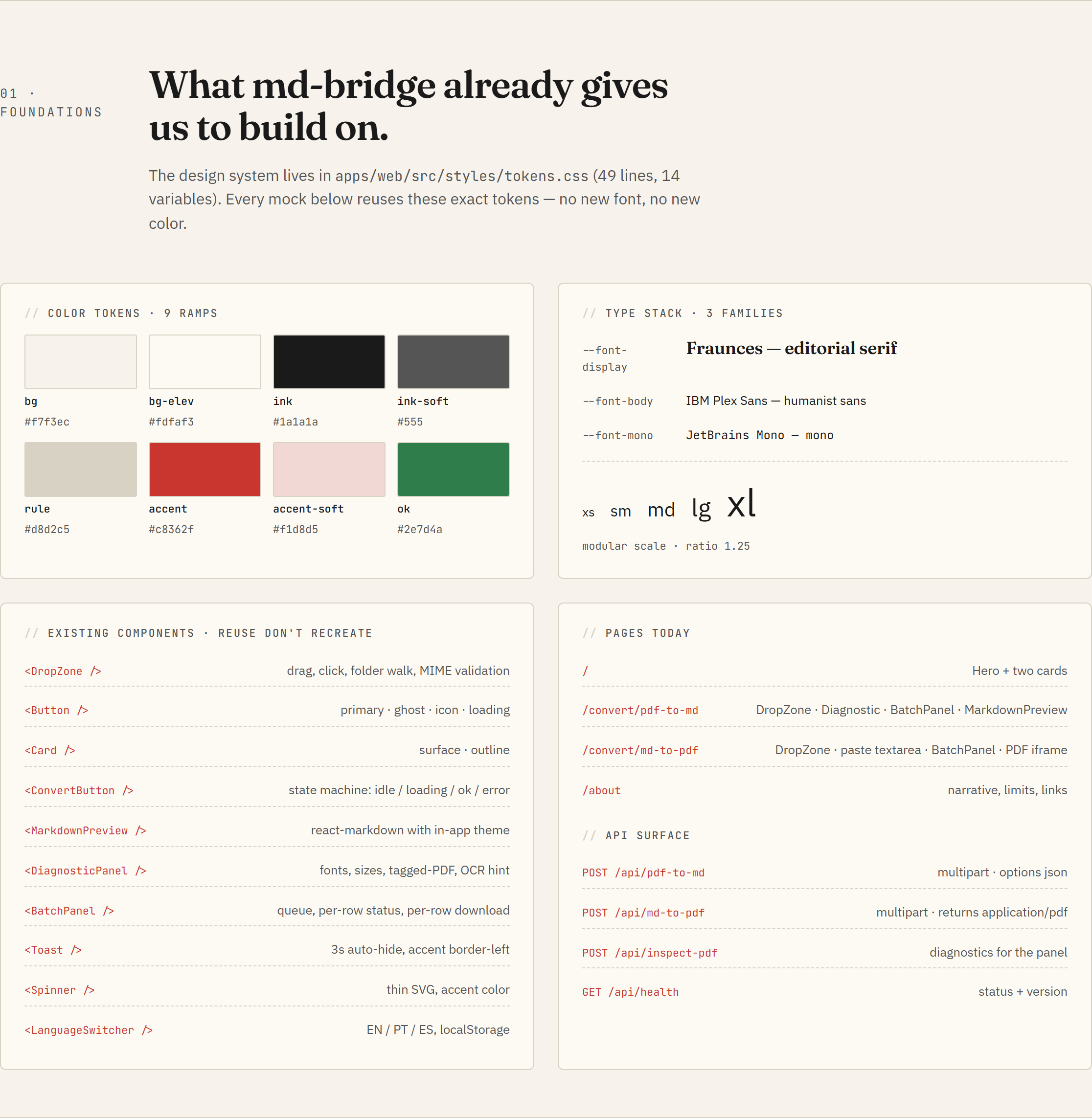
The "Foundations" section of the catalogue inventories what already ships: tokens, type scale, component primitives, routes, and API endpoints. Every new feature reuses them before adding anything new.
How to propose a UI feature
The workflow has two paths.
Picking up an existing design-required issue
- Open the issue and read the body.
- Scan the catalogue for the matching F-section (the maintainer will usually drop a link in the issue thread).
- Implement against the mockup. Match the visual output; do not copy the HTML structure verbatim. The prototype is for visual reference; the React tree is up to you.
- Open the PR. Reference the issue and link the catalogue section in the description.
Proposing a brand-new UI change
- Open a feature-request issue with a sketch (Excalidraw, plain PNG, even ASCII).
- The maintainer decides whether the change slots into an existing F-section or warrants a fresh design pass.
- If a new design pass is needed, the maintainer runs it (see below)
and updates the catalogue. The issue gets the
design-requiredlabel so contributors know to wait for the mockup.
How the catalogue gets updated
The HTML in docs/design/design-thinking.html was generated with
Claude Design, an AI design tool that
produces HTML/CSS/JS prototypes. The maintainer iterates inside the
tool, the tool exports a self-contained HTML bundle, and that bundle
replaces the file in this directory.
If a feature in the catalogue needs revision (visual bug, missing state, broken responsive behaviour), open an issue with the screenshot and the F-section number. Edits to the catalogue ship as their own commit so the design history stays inspectable in git.
Token contract
The HTML in the catalogue declares its CSS variables at the top of
its <style> block, copied verbatim from
apps/web/src/styles/tokens.css.
Anything that ships in the React app uses the same variables. Two
consequences:
- Changing a token in
tokens.cssautomatically changes the React app. The catalogue holds its own copy and needs a manual sync; the commit that updates the tokens should update the HTML block in the same PR. - New tokens added to
tokens.cssshould land in the catalogue HTML at the same time, otherwise mockups using them will fall back to defaults.
Why a single HTML file
A static, self-contained HTML is the lowest-friction format for a design catalogue inside an open-source repo:
- Anyone can view it in a browser, no build step, no node_modules.
- Diffs are readable in PRs: token changes and copy edits show up as plain lines.
- GitHub Pages serves it as-is, so the public URL is the same as the raw repo file.
- The format the design tool ships matches the format we commit, so there is no transformation step that can desync.
The alternative (Figma, Penpot, a Storybook tree) adds tooling weight that does not pay for itself at the project's current size.